Self-Reflection
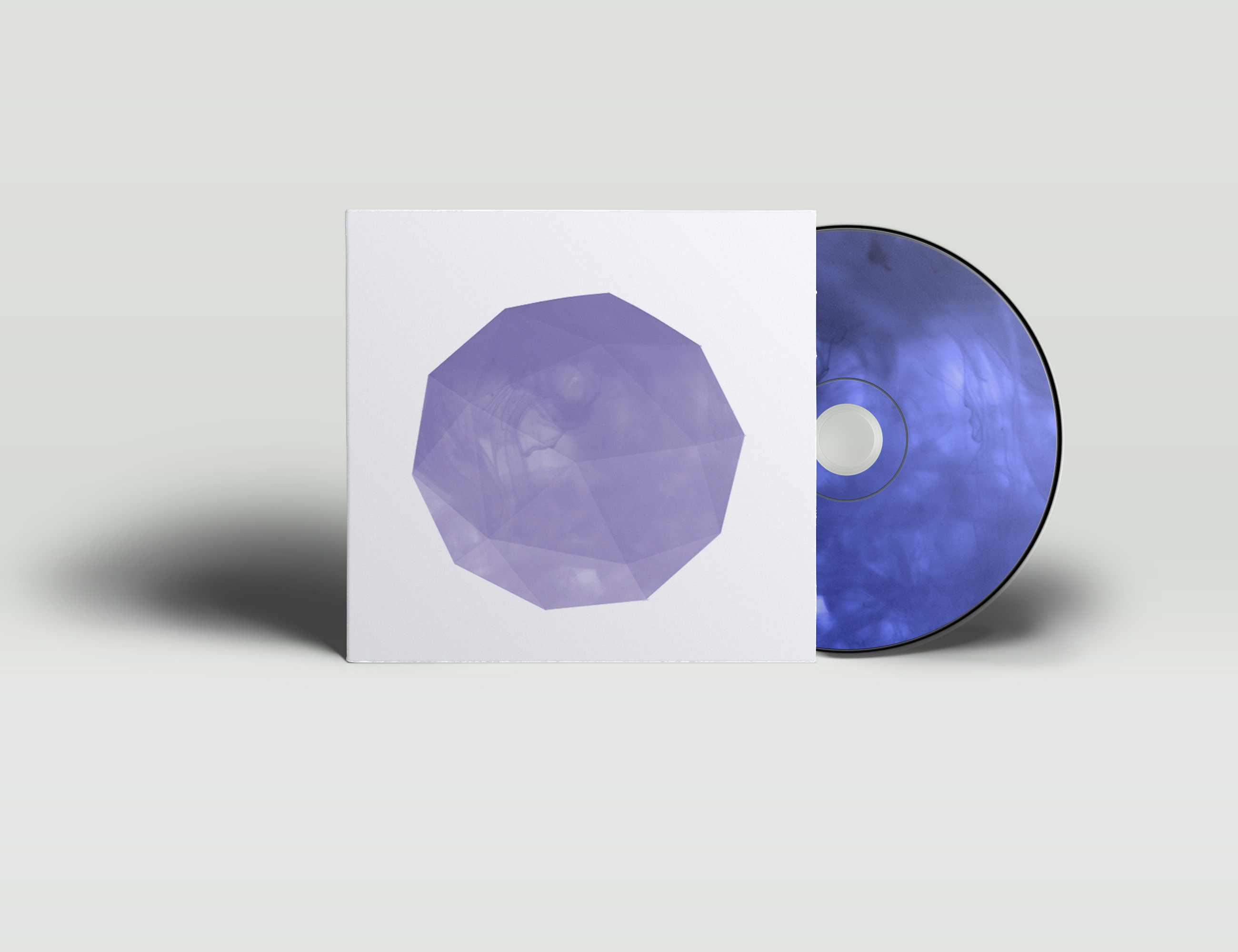
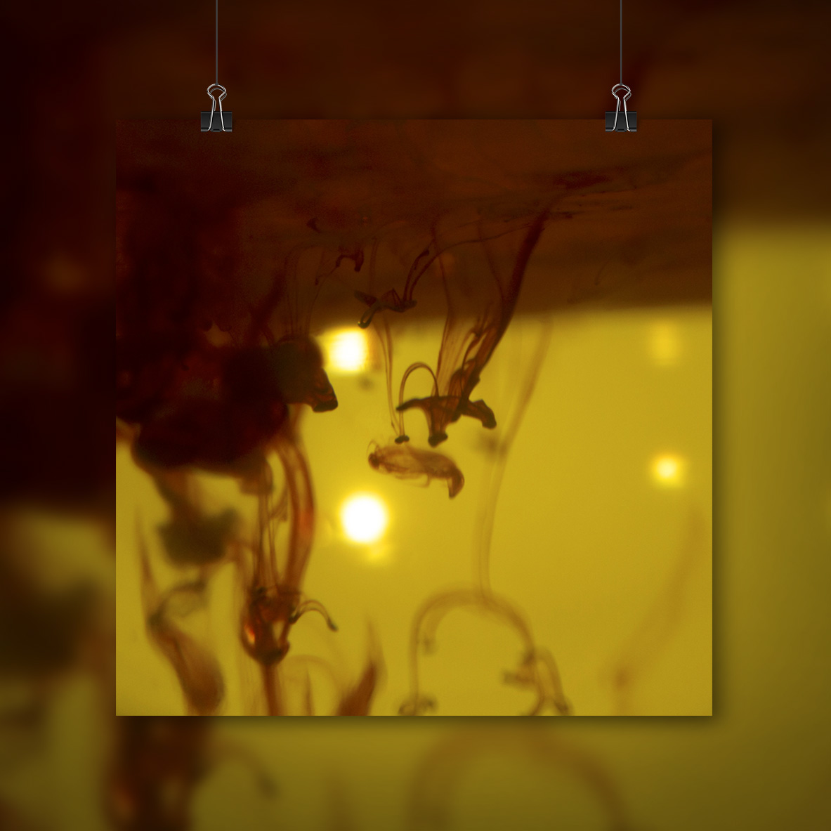
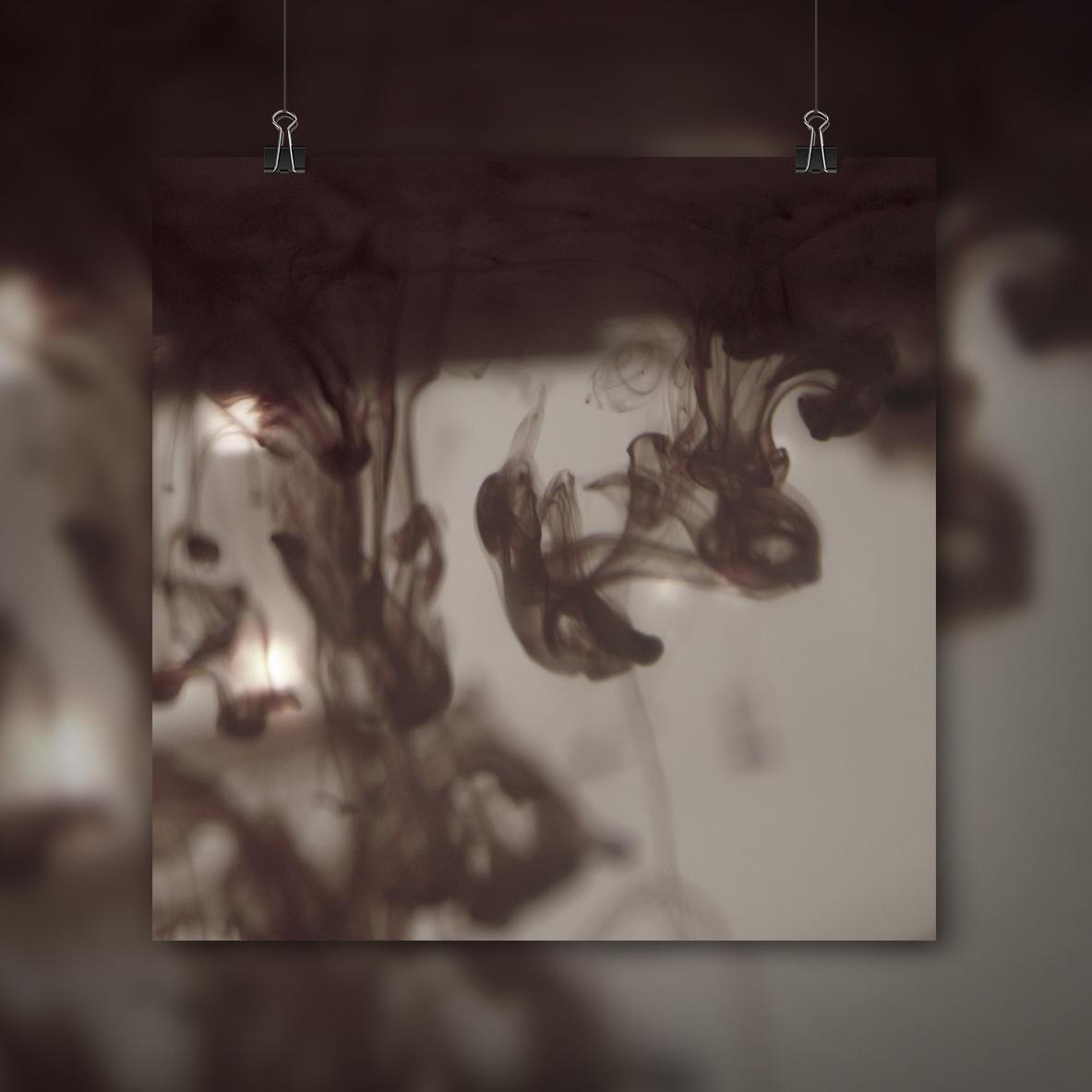
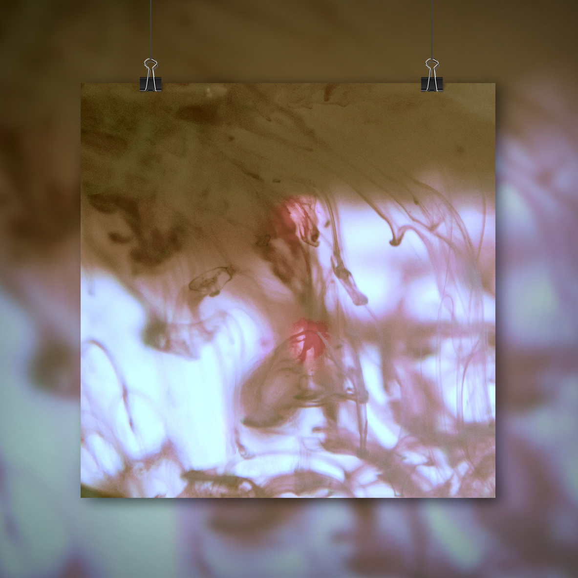
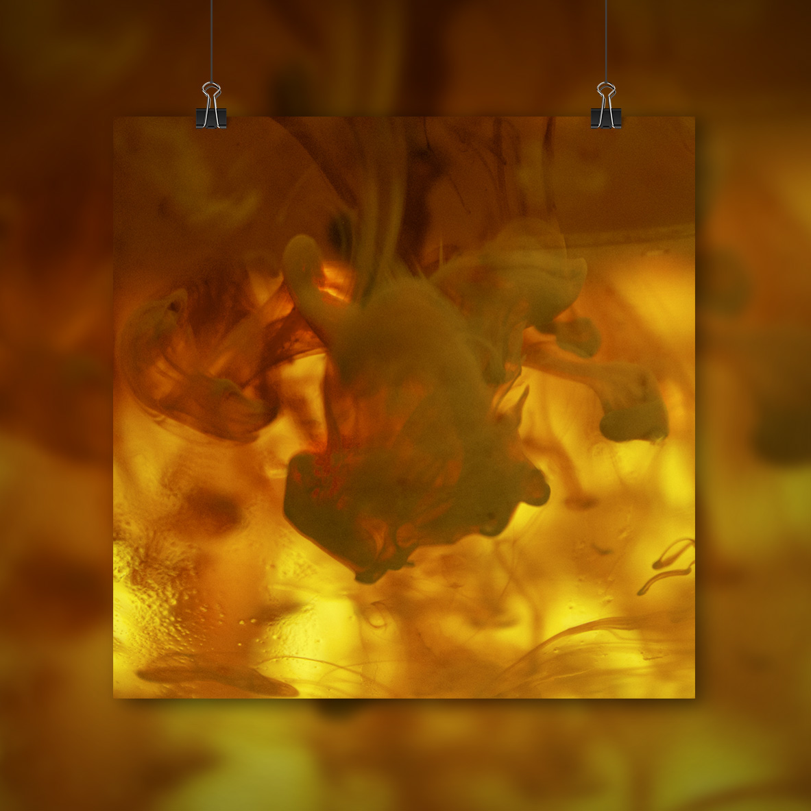
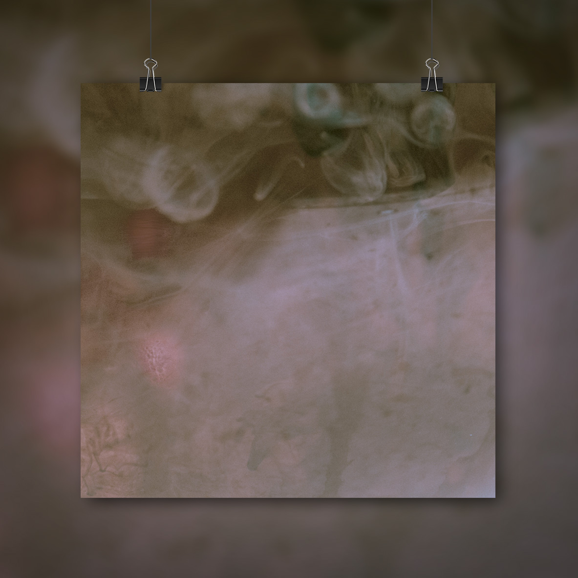
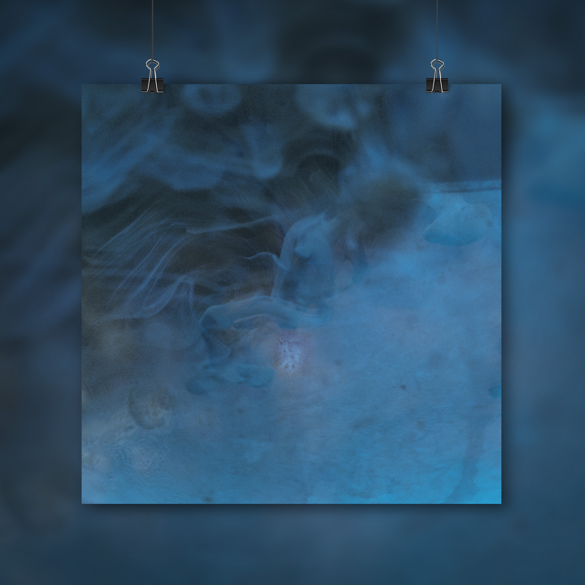
Music Branding & Art Direction using ink and water across digital and printed formats.

The Brief
This was made for a class project called metamorphosis, we had to make a brand and show it adapts across different formats. I made a compilation album called Self-Reflection and producded a the following out comes,
My Approach To The Project
I chose the following tracks as this is the kind of music I listen to both when I'm working and relaxing. It's music that's very focused on atmosphere and I find myself having deep personal thoughts to myself when I'm not in the best. I hope when you listen to the music you can a good idea of what I was trying to aim for with the art direction and logo for this project
My main inspiriations for this project were Tycho. Chrome Sparks, Porter Robinson, Jack Vanzet and these two Vimeo projects. One called FLOW - The Making Of by Studio Hands and the other was S O P E - Pick Me Up Festival 2015 by Oliver Bloor.
I love the art direction of both Tycho & Chrome Sparks, I love the use of geometric designs in both these artists work and I also really like the use of colourful textures in there art direction. (espcailly in Tycho's live show visuals)
Porter Robinson: Worlds is one of my favoruite albums and I got the special edition of it which came with a vinyl, cd and amazing artwork for all the songs on it. I had to produce multiple outcomes for my class project, looking at how the art direction worked across all the stuff in this album box set and in the Worlds Live show visuals I felt this was a huge inspiration.
I love the exsperiemntal paint textures inJack Vanzet's work and I love how well it looks in his 3D and album artwork projects. I found his use of traditional and digital techniques very inspiring.