Personal Branding
A look into my logo and the story behind it.
The Story Behind My Logo
I wanted my logo to represent where I am at the momemt both creativly and personally. I want to explore diffrent creative outlets and take on different projects even if some are out of my comfert zone. (I also wanted it to represent working towards your goals, which is something that's been on my mind a lot recently) I also a logo that would work along side all my different creative outlets (i.e. I didn't it to just represent design or video or photo etc)
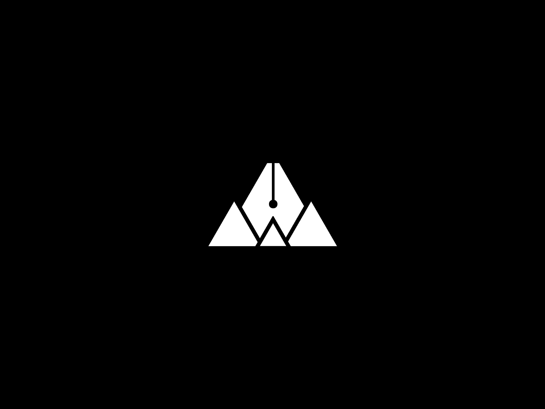
My logo is a little mountain landscape to represent working towards your goals. (both creativly & personally) The inspiration for the mountain was from my favourite video game Journey. I played it when I was going through a bit of a rough patch and it's approach with the subject matter of life and having motivation to keep going and reach your goals really resonated with me.
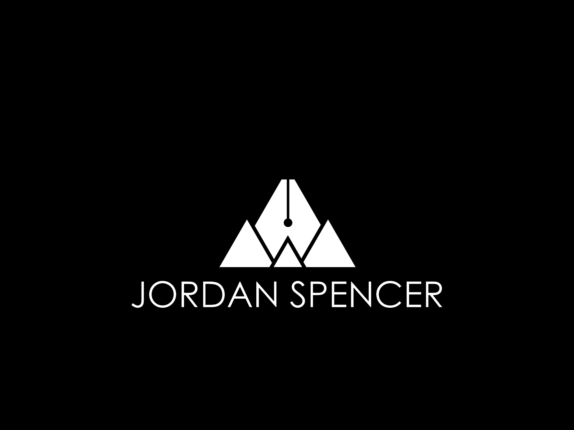
I used Century Gothic Regular for my name type, I just felt it work well along side the modern / geometric aesthetic I was aiming for with my icon/logo. I mainly want to just use the icon part on it's own (without sounding biased about my own work, I'm like the look of the icon a lot and I feel it's stronger from a visual pint of view on it's own)
The flat surface and line with the circle at the bottom in the middle mountain is there to make it look like the end of an ink pen ( / resemble Adobe Illustrator pen tool icon) to represent my creative outlets and how I try to challenge myself to reach new hights with my work.

Mountains x Fountain Pen = Main logo
White w/ Black Logo v.1
White w/ Black Logo v.2
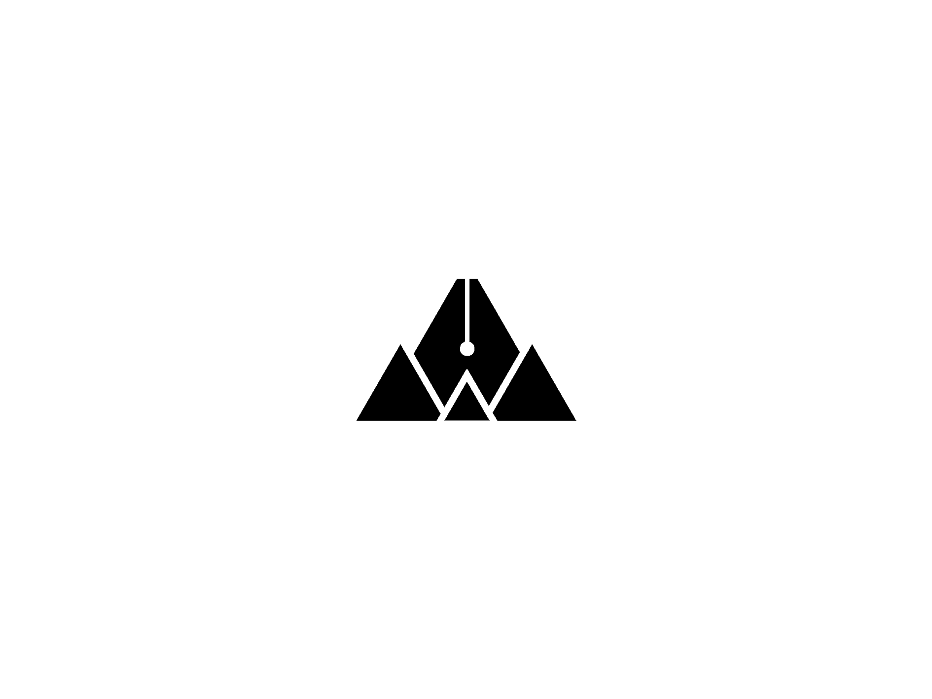
Black w/ White Logo v.1

Black w/ White Logo v.2

Branding Mock Up